Illustration: New York Times
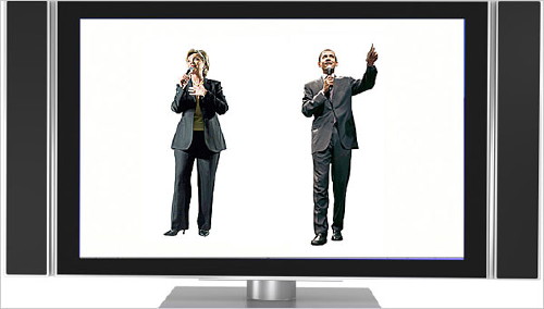
Die New York Times vergleicht die Websites der beiden demokratischen Kandidaten im US-Wahlkampf. Und siehe da: Hillary Clinton kommt im Web eher wie ein PC daher, Barack Obama wie ein Mac.
Mr. Obama’s site is more harmonious, with plenty of white space and a soft blue palette. Its task bar is reminiscent of the one used at Apple’s iTunes site. It signals in myriad ways that it was designed with a younger, more tech-savvy audience in mind — using branding techniques similar to the ones that have made the iPod so popular.
In contrast to barackobama.com, Mrs. Clinton’s site uses a more traditional color scheme of dark blue, has sharper lines dividing content and employs cookie-cutter icons next to its buttons for volunteering, and the like.
Die gute, alte Metapher von Umberto Eco trägt hier übrigens nicht: Obama ist nicht katholisch und unter katholischen Wählern nicht mehrheitsfähig.